Malnutrition In Numbers:

Graph #1
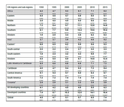
This graph shows the percentage of the regions and sub-regions of underweight in general. We can see that the country who suffered the most during the 1990`s was Asia; the number of people suffering from underweight was 32, 9%. Ten years later in 2000 the number decreased to 25, 9%. Although this number decreased, the continent of Asia doesn’t include Japan. Another part of the continent that had a great percentage of malnutrition was he eastern part of Africa with 27, 2%; although in 2010 the number decreased to 19, 6%. We can see that the developed countries in the year 1990, the number was pretty low with 1, 5% but in 2010 this percentage increased to 2, 3%. Surprisingly, Latin America and the Caribbean in the 1990 the percentage number was 7, 7% and in 2010 it reduced to 3, 5%.
This graph shows the percentage of the regions and sub-regions of underweight in general. We can see that the country who suffered the most during the 1990`s was Asia; the number of people suffering from underweight was 32, 9%. Ten years later in 2000 the number decreased to 25, 9%. Although this number decreased, the continent of Asia doesn’t include Japan. Another part of the continent that had a great percentage of malnutrition was he eastern part of Africa with 27, 2%; although in 2010 the number decreased to 19, 6%. We can see that the developed countries in the year 1990, the number was pretty low with 1, 5% but in 2010 this percentage increased to 2, 3%. Surprisingly, Latin America and the Caribbean in the 1990 the percentage number was 7, 7% and in 2010 it reduced to 3, 5%.
Graph #2:
In this graph we can find the comparison on overweight between different countries. The country that had the highest percentage of people suffering from overweight was the developed countries with 7.4%. The south-eastern part of Asia was the region that had the lowest percentage with 1.8% which increased to 5.8% in the year 2010. In 2010 the region that had the highest percentage was the southern part of Africa with 15.6%. The south-central part of Asia was the one that had the lowest percentage with 3.0%. In the year 2015, the southern part of Africa will be the highest overweighed region with 19.4% and the lowest will be the south-central part of Asia with 3.3%. Latin America & the Caribbean in 1990 was a region that was inside the average with 6.5% and in the year 2010, increased to 7.3%.
The developed countries were the ones that increased amazingly from 7.% in the year 1990 up to 14.1% in the year 2010 and it will increased approximately to 16.4 in the year 2015. Oceania started the graph with just 2.6% in 1990 and increased to 3.6% in the year 2010. It is expected to increase to 3.9% in the year 2015. Asia in 1990 was a region that had a percentage of 3.7%, but unfortunately increased to 4.6% in 2010. Specialists think that by 2015 it will increase to 5.2%. In the year 1990, Africa was a region that had a low percentage of overweight, it was only 4.2%, but in 2010 it increased to 7.1% and it will keep increasing to 8.2% in the year 2015.

Graph #3:
This graph shows the evolution of the chronic hunger in kids younger than five years old. It shows malnutrition in Peru's rural and urban areas and in total. In the rural areas, in the year 1992 the percentage was 53.4% and in the year 1996 it decreased to 40.4%. In the year 2010 it decreased to 31.3%. In the urban areas the numbers weren't so high. In the year 1992, the percentage was of 25.9% and in the year 2009 it decreased unbelievably to 9.9% but in the year 2010 it increased to 10.1%. The percentages of total were in the middle but it has decreased from 36.5% in 1992 to 17.1% in the year 2010.
This graph shows the evolution of the chronic hunger in kids younger than five years old. It shows malnutrition in Peru's rural and urban areas and in total. In the rural areas, in the year 1992 the percentage was 53.4% and in the year 1996 it decreased to 40.4%. In the year 2010 it decreased to 31.3%. In the urban areas the numbers weren't so high. In the year 1992, the percentage was of 25.9% and in the year 2009 it decreased unbelievably to 9.9% but in the year 2010 it increased to 10.1%. The percentages of total were in the middle but it has decreased from 36.5% in 1992 to 17.1% in the year 2010.
